Optima Font
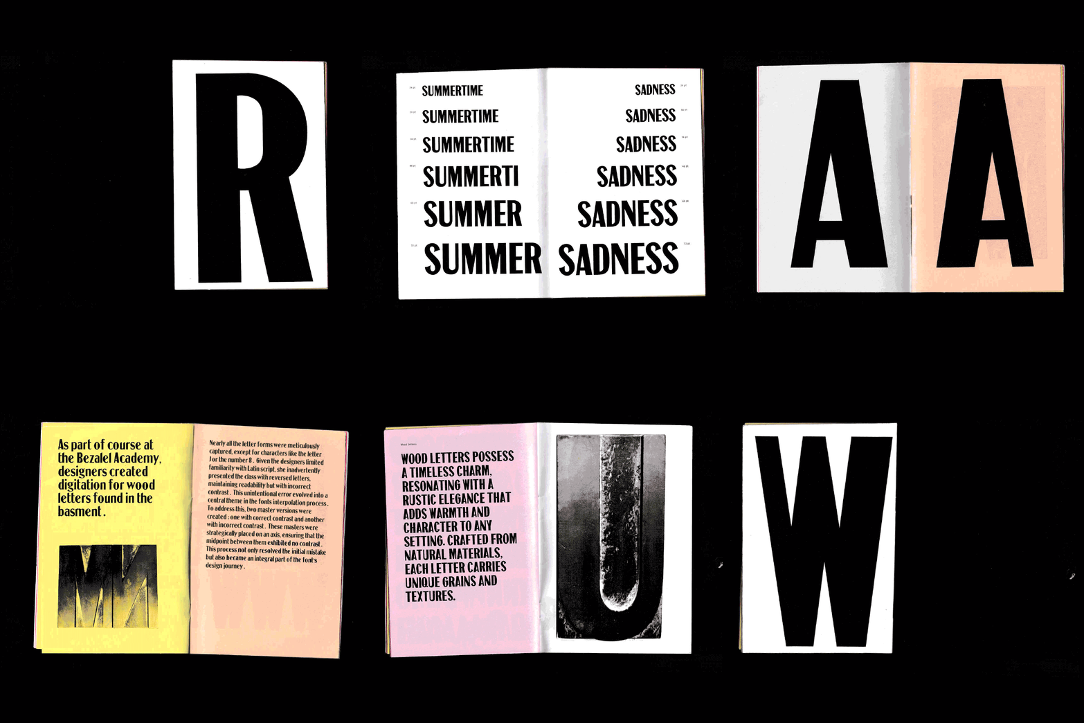
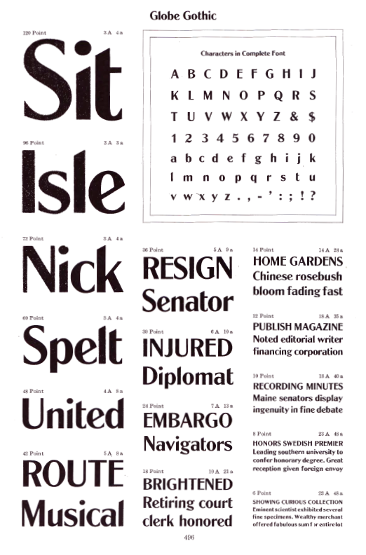
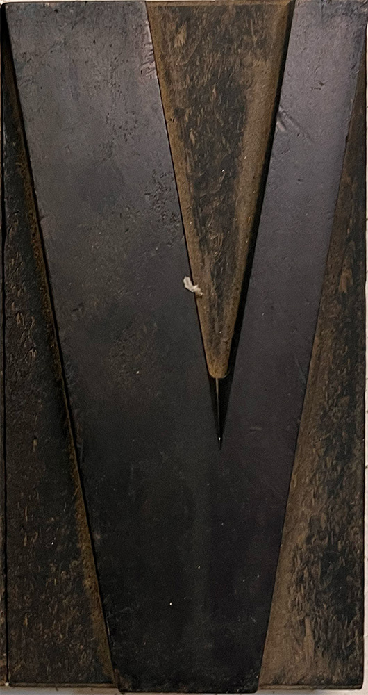
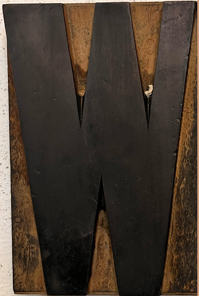
Optima was created as part of the "Letter Design" course with Daniel Gromer. For the course, we digitized wood type found in storage at Bezalel — each of us chose one typeface, photographed it, and redrew it letter by letter as glyphs. The assignment was to give it an interesting twist: a sharp weight, some kind of variability, something of our own.
I chose Optima. And a mistake I made along the way ended up becoming the whole project. While digitizing the letters, I didn't notice the contrast was reversed — so for some letters, like a, n, and m, I effectively redrew them as if mirrored, since contrast was the only real difference between the correct and reversed versions.
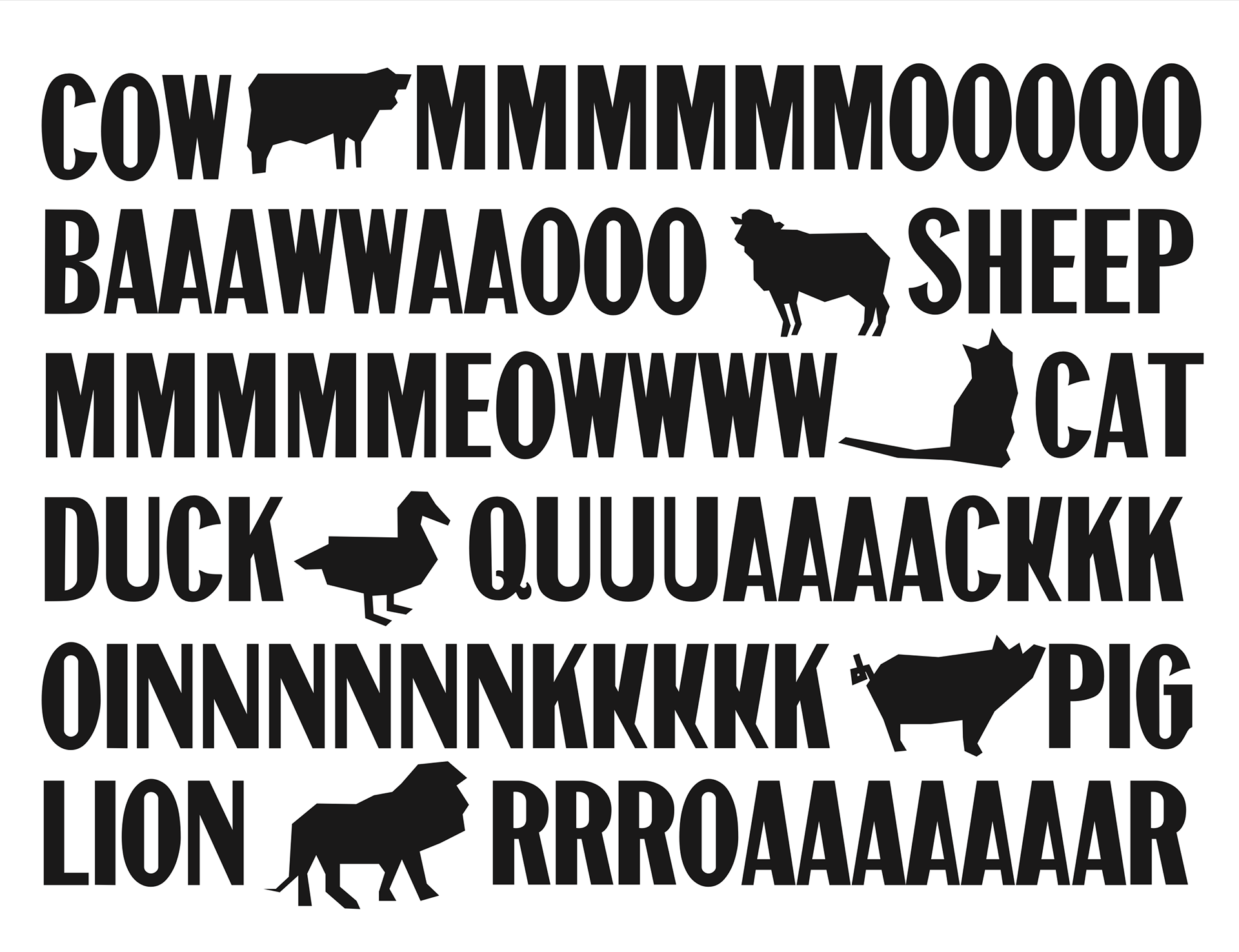
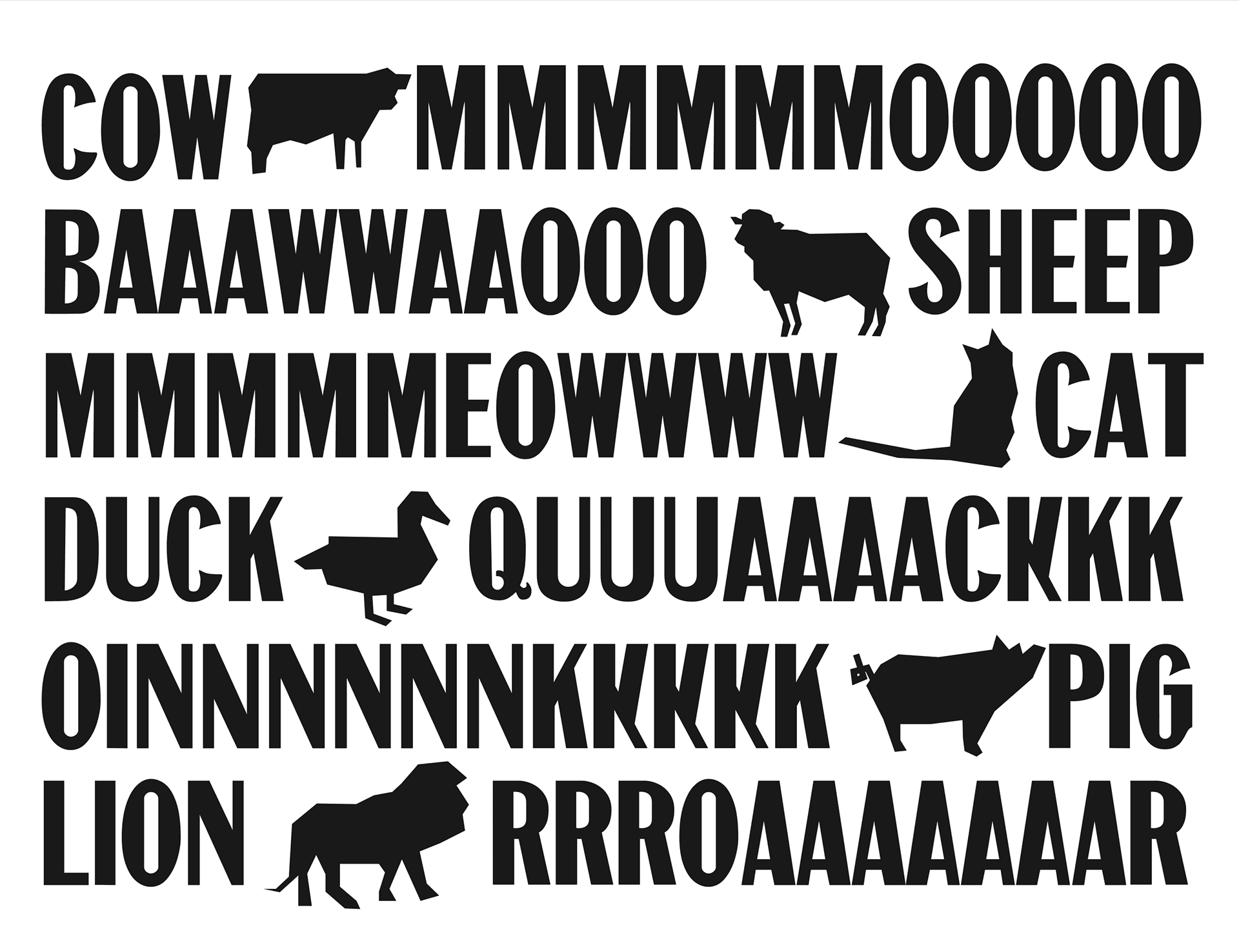
That mistake is what made me realize what the project actually was: a strange, variable display typeface built around contrast. The designer can shift the contrast on the relevant letters and produce a look that's a little "broken," a little illogical.